world's children

design thinking
for web design

services

User Research
Competitive Analysis
User Profiles (Personas)
Digital Strategy
Web Design
Front-end Development

Timeline : 6 months

Tools : FIGMA, Illustrator, Photoshop, WordPress, CSS, HTML, PHP

Contact me about this project.

the project

World’s Children wanted a website that would reach a wider audience and encourage more user interaction. They weren’t sure how to achieve these goals. However, through research and testing the priorities became clear.

We focused on improving navigation, an easy check-out process, and storytelling to achieve these goals.

For the best viewing experience, this case study must be viewed on a desktop device.

In the meantime, you can explore this case study’s overview for a quick glimpse of my work.

the Challenge

Driving Impact in Non-profit

A key challenge was understanding World’s Children’s unique approach to fundraising. Unlike traditional nonprofits, they generate revenue through a combination of individual, group, and project-based initiatives. This comprehensive model significantly influenced design strategy, guiding us towards innovative and creative solutions.

Quick Links to popular topics

Research for this project included user research (observational, quantitative, and qualitative) and competitive analysis

For user personas, business goals, and a problem-solution matrix head over to the Define section.

Ideation for this project includes sitemap, task flow, low-fidelity wireframes, and responsive wireframes.

Finally, I design and incorporate a mood board, UI kit, and high-fidelity wireframes into a high-fidelity prototype.

Research + Empathize

who and why

We started by getting to know World’s Children’s audience intimately through observational, quantitative, and qualitative research.

Survey Flow

Actionable Recommendations

Content and Interest: The data revealed a strong user interest in content that explores the regional impact of human trafficking. This suggests a desire to understand the specific challenges faced by different areas.

Optimize Navigation for Sponsorships: Prioritize placement and clarity of  content-specific “Sponsor” or “Sponsorships” within the main navigation to cater to user interest.

Streamline User Journey: Based on minimal clicks on “Gift Catalog” and “Donate” across all pages, consider removing these options from the main navigation because they lead to separate landing pages and lead to confusion.

Add Partnership Opportunities: A dedicated portal for partners would streamline inquiries and application processes as well as offer donation history and personalized communications, facilitating a deeper relationship.

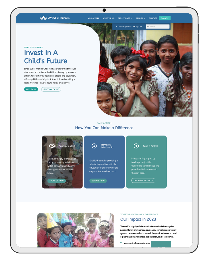
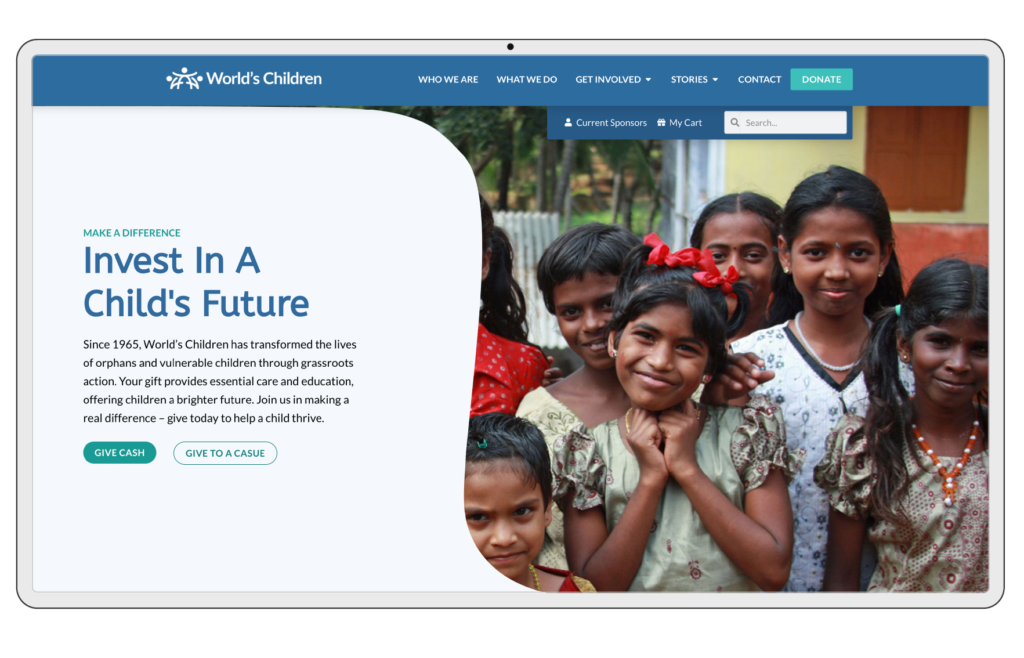
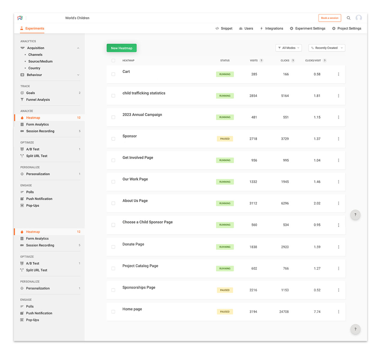
Focus on Core Pages: Retain “About Us,” “Our Work,” and “Get Involved” in the main navigation as they received significant user engagement.

Enhance User Experience: The low engagement with “Items Cart” suggests a potential issue with the shopping cart functionality or user clarity. Investigate and improve this section.

Enrich Navigation (Optional): Consider adding a “Contact” option to the main navigation, potentially drawing inspiration from its placement in the footer.

Submenu Options: Explore the possibility of implementing submenus within the main navigation for options like “Choose a Child” under a “Sponsorships” umbrella. This can help users find specific sponsorship options with ease.

By implementing these recommendations, their user engagement increased. Users could find the information they needed within 1-2 clicks and also enjoyed browsing.

I cannot emphasize curiosity enough. Curiosity is the key to progress. Until we truly understand the issues, the solutions will remain hidden.

Competitive Analysis

others vs. us

By understanding their competitors’ user experience and approach to sponsorships, I identified opportunities to differentiate World’s Children.

Actionable Recommendations

Enhanced Navigation: Implement clear and intuitive navigation to simplify finding information.

Search & Sort: Enable users to quickly locate specific details with search and sorting functionalities.

Mobile Responsiveness: Ensure a seamless experience across all devices with a responsive layout

Accessibility: Adjust color schemes to meet accessibility standards for wider user inclusion.

Financial Transparency: Maintain prominent access to financial information for user trust.

Credibility Builders: Showcase partner logos, regulatory certifications, and testimonials to establish credibility.

I cannot emphasize curiosity enough. Curiosity is the key to progress. Until we truly understand the issues, the solutions will remain hidden.

Define + Contextualize

making research tangible

Foster a shared understanding of the user audiences and project objectives amongst all stakeholders.

John and Martha, Retired

Actionable Recommendations

Click on the arrow icon under each persona to view specifics. 

Despite their differences, personas all valued availability of information on donation methods, transparency in allocation of funds, and donation impact.

Emma, Teacher

Dr. Sophia, Doctor

I don't just see data points, I see people. By weaving together research and analytics, I paint a clear picture of the who, what, and why behind every click and interaction.

Why are we communicating with users?

Key Business and Website Goals

To measure the success of your website changes, we’ll track their impact on key organizational benchmarks. Here’s an overview of these metrics based on 2022 data (percentages are totals calculated for the entire year):

Cost of Acquisition (CAC):

Formula

Total Advertising Expenses / New Donors + New Volunteers + Individuals Contributing to Mission

Use Case

This metric reveals the average cost of acquiring a new supporter (donor, volunteer, or other contributor) through your website. A lower CAC indicates a more efficient use of advertising resources.

2022

$587.87

2024

$628

Lifetime Value (LTV):

Formula

Total Annual Donations from New Donors / Number of New Donors

Use Case

LTV represents the average amount a new donor contributes in their first year. It helps understand the long-term financial value of acquiring new donors.

2022

$383.43

2023

$425

Close Rate:

Formula

Number of Donations + Volunteer Signups / Total Website Visitors

Use Case

The close rate indicates the percentage of website visitors who convert into donors or volunteers. A higher close rate suggests a more effective website in driving desired actions.

2022

0.70%

2024

0.74%

Donation Rate:

Formula

Number of Donors Re-Donating More Than Once / Total Number of Donors

Use Case

The donation rate reflects the percentage of existing donors who donate again within the year. A higher rate indicates stronger donor loyalty and engagement.

2022

52%

2024

60%

Donation Cross-Sell Rate:

Formula

Number of Donors with More Than 1 Donation Cause / Total Number of Donors

Use Case

The donation cross-sell rate reveals the percentage of donors who contribute to multiple causes offered on your website. A higher rate suggests successful efforts in promoting diverse giving opportunities.

2022

14.7%

2024

18%

Tracking Changes and Optimization:

By monitoring these metrics before and after website changes, we can assess the impact of those changes on donor acquisition, engagement, and overall contribution to your mission. This data will guide future website optimizations to achieve your business goals.

Andrea's Note

Lorem ipsum dolor sit amet, consectetur adipiscing elit. Ut elit tellus, luctus nec ullamcorper mattis, pulvinar dapibus leo.

Branding

What are we improving to reach our goals and our audience?

Problems -> Solutions

Ideate

the plan

Evaluating and prioritizing ideas based on their potential impact, feasibility, and alignment with user needs and business goals.

conceptualized solution

Meeting the Needs of Users

Based on the priorities, challenges, and goals identified, this map was created to directly addresses them. Each category will contain multiple subpages, offering users a clear and organized path to find the information they need.

View Home Page Wireframe

View Responsive Donate Page Wireframes

View Responsive Home Page Wireframes

View Responsive Blog Page Wireframes

conceptualized solution

I strategically utilized card-based sections within the wireframes. This modular approach ensured the content would adapt seamlessly across different devices, from desktops to mobile screens. The card-based structure not only facilitated responsiveness but also proved to be a highly efficient way to organize and prioritize content.

Wireframes are the blueprints of user experience. They allow us to experiment with layouts and functionality before investing time and resources in aesthetics. It's like sketching the foundation of a house before laying the bricks - crucial for creating a user experience that's both functional and delightful.

Branding is more than just a logo and colors; it's the essence of your organization. As a UX designer, I translate this essence into an experience where users can connect with your personality on a human level.

Prototype

what and how

When prototyping I strive to bring my design ideas to life and start testing them with users.

View Responsive Donate Page Wireframes

View Responsive Donate Page Wireframes

Mood board

For the mood board, I took a sensory-based approach, focusing on sight, touch, and smell. These senses evoked feelings of trustworthiness, inspiration, inclusiveness, and dedication, key brand attributes I wanted to capture.

The goal was to elicit a visceral response, creating a deep bond between donors and the brand. 

View Responsive Home Page Wireframes

solidified solutions

These high-fidelity wireframes included interactions which allowed me to test my design assumptions with real users early in the development process and iterate.

Quick Links:     Research   Critical Assemblage    Ideation   Prototype

World's Children: Project Overview

The plan

Using the design thinking framework to launch an engaging and action-inducing website.

This project follows a clear four-stage approach, designed to deliver a website that not only looks great but actively supports World’s Children’s goals.

Details

World’s Children desired an updated website with intuitive navigation, elevated branding, and responsive design with an easy check-out process.

CLIENT NAME : World’s Children

PROJECT TYPE :  UX/UI Design, Branding Development

TIMELINE : 6 months

TOOLS : FIGMA, Illustrator, Photoshop, WordPress, CSS, HTML, PHP

ROLES : UX Researcher, UI Designer, Developer

Project phases

This project includes four out of the five design thinking framework phases. 

The Research phase includes the competitive analysis and user (observational, quantitative, and qualitative) research.

The  Define phase includes the user personas, business goals, and a problem-solution matrix.

The Ideation phase includes the sitemap, task flow, low-fidelity wireframes, and responsive wireframes.

And finally, the Prototype phase which includes the mood board, UI kit, high-fidelity wireframes, and high-fidelity prototype.

How I used the design thinking approach:​

Deep Dive into Competitors and Empathize with Users

The team started by getting to know World's Children's audience intimately through observational, quantitative, and qualitative research.

Define and Contextualize

Leveraging insights from Stage 1, I participated in crafting personas, a problem-solution matrix, and an outline of business goals to inform the design of a website that surpasses the current one.

Ideate

In this stage, we develop the foundation for their website, which includes a sitemap, task flow, and wireframes. 

Prototype

I developed an enhanced brand identity and interface kit, hi-fi wireframes, and, finally, the prototype.

Project goals:

Simplify Navigation

Create an intuitive and responsive navigation system that's easy to use on any device.

Frictionless Donations

Create a smooth and user-friendly experience that encourages them to become heroes for children.

Focus on Impact Above the Fold

Capture attention with inspiring content and a clean, uncluttered design.

Storytelling and Hero's Journey

Showcase the stories of the children they help in a captivating way. Let donors see the difference they can make.

To view this case study in its entirety, revisit here on a desktop device.

F.Y.I.

This portfolio is under construction.
You may stumble upon some unfinished business.

World's Children: Project Overview

The plan

Combining a database model with a hierarchical model.

By combining the hierarchical structure for navigation with the flexibility of a database model for content organization, their website benefits from:

Details

World’s Children desired to add search and sort capabilities, which take into consideration several forms of post-types.

CLIENT NAME : World’s Children

PROJECT TYPE :​​ UX/UI Design Development

TIMELINE : 1 month

TOOLS : FIGMA, Illustrator, Photoshop, WordPress, CSS

ROLES : UI Designer, Developer

Project phases

This project includes Ideation and Prototype phases. 

The Ideation phase includes the donor task flow, low-fidelity wireframes, and responsive wireframes. The Prototype phase which includes the mood board, UI kit, high-fidelity wireframes, and high-fidelity prototype.

Note: This project leveraged research conducted during our website redesign for this client, ensuring a cohesive and data-driven approach.

You can view Research and Define assets here.

Using the design thinking framework.​

Ideating

In this stage, I brainstorm the foundation for their solution, which includes the donor task flow and wireframes. 

Prototyping

Then, I developed hi-fi wireframes, and, finally, the prototype.

To view this case study in its entirety, revisit here on a desktop device.

Coming soon

I’m in the process of adding or updating this project. Come back soon. 

Download my resume