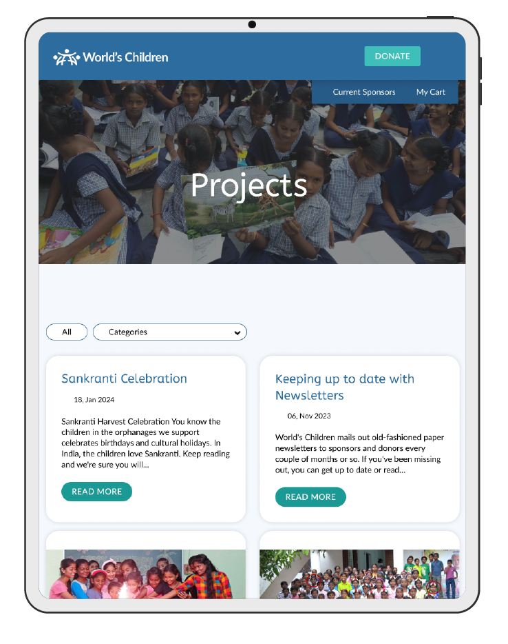
For the best viewing experience, this case study must be viewed on a desktop device.
In the meantime, you can explore this case study’s overview for a quick glimpse of my work.
UI Design
Web Design
Front-end Development
Timeline : 1 month
Tools : FIGMA, Illustrator, Photoshop, WordPress, CSS, HTML, PHP
Contact me about this project.
World’s Children wanted to engage donors in new, deeper ways – starting with helping donors find the causes they care the most about.
By combining the hierarchical structure for navigation with the flexibility of a database model for content organization, World’s Children now has an intuitive and scalable UI.


A key challenge was understanding World’s Children’s unique approach to fundraising. Unlike traditional nonprofits, they generate revenue through a combination of individual, group, and project-based initiatives. This comprehensive model significantly influenced design strategy, guiding us towards innovative and creative solutions.

This UI project kicks off with the ideation of a donor task flow, low-fidelity wireframes, and responsive wireframes.
Lastly, I design and incorporate a mood board, UI kit, and high-fidelity wireframes into a high-fidelity prototype.
(This project leans on research previously completed. You can view the research here.)
Evaluating and prioritizing ideas based on their potential impact, feasibility, and alignment with user needs and business goals.
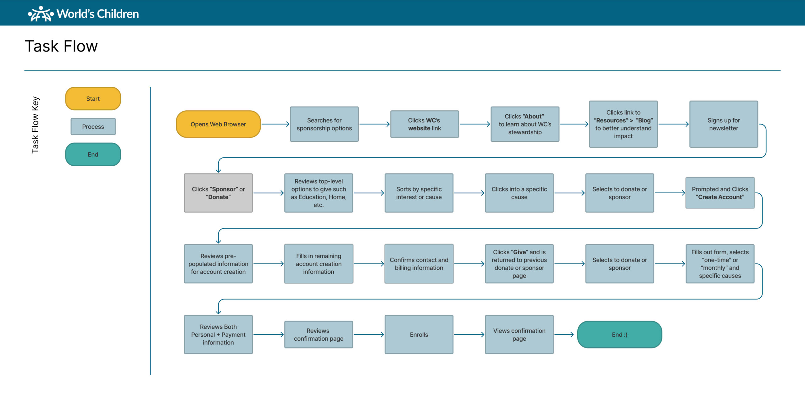
Based on the research completed before this UI project, this user task flow diagram maps out the steps a user takes to complete a specific task on the website. The three user personas I developed were central to this process. By keeping their needs, motivations, and potential challenges at the forefront, I ensured the task flow caters to their expectations and avoids any roadblocks.
To jumpstart the design process, I opted for a good ol’ fashion approach – sketching with paper and pen. This allowed for rapid iteration and exploration of layout ideas before transitioning to a digital format.
Responsiveness was a critical aspect of the project brief. To tackle this challenge, I strategically employed a card-based structure within the wireframes. This modular approach ensures content seamlessly adapts and rearranges across various devices.
The card-based system not only facilitated responsiveness, it is a highly efficient way to organize and prioritize content for readers.
Wireframes are the blueprints of user experience. They allow us to experiment with layouts and functionality before investing time and resources in aesthetics. It's like sketching the foundation of a house before laying the bricks - crucial for creating a user experience that's both functional and delightful.
When prototyping I strive to bring my design ideas to life and start testing them with users.
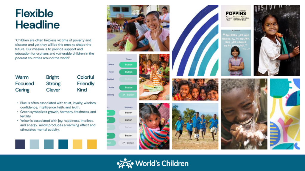
For the mood board, I took a sensory-based approach, focusing on sight, touch, and smell. These senses evoked feelings of trustworthiness, inspiration, inclusiveness, and dedication, key brand attributes I wanted to capture.
The goal was to elicit a visceral response, creating a deep bond between donors and the brand.
High-fidelity wireframes go beyond basic shapes and include visual elements like icons, fonts, and colors. I was super excited to get to this level of detail in the project as it provides a clear picture of the intended user interface, minimizing confusion and ensuring everyone involved in the project is on the same page.
A Multisensory Approach
For the mood board, I took a sensory-based approach, focusing on sight, touch, and smell. These senses evoked feelings of trustworthiness, inspiration, inclusiveness, and dedication, key brand attributes I wanted to capture.
Walking the Walk
To further solidify the user experience, I included images representing those positively impacted by donors. This helped visualize the environment recipients and donors would encounter if interacting in person. The goal was to elicit a visceral response, creating a deep bond between donors and the brand.
Striking the Right Balance
Fresh teals, blues, and yellows were chosen for the color scheme, aiming for a serious yet vibrant feel. This conveys a sense of approachability, especially for a younger demographic.
Iconography
The iconography needed to balance the warmth and strength expected from a charity. The goal was to avoid a utilitarian or stuffy aesthetic, while still reflecting the seriousness of important life-changing work.
Font Choice: Accessibility Meets Modernity
A clean sans-serif typeface was selected for its modern and fresh look. However, readability and accessibility for all users remained a top priority.






Happy Clients Around World
Average Rating From Clients
Successfully Completed Projects
Best Services Award Achieved
Quick Links: Research Critical Assemblage Ideation Prototype


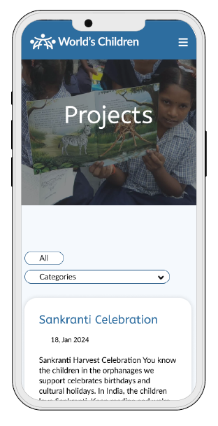
By combining the hierarchical structure for navigation with the flexibility of a database model for content organization, their website benefits from:
World’s Children desired to add search and sort capabilities, which take into consideration several forms of post-types.
CLIENT NAME : World’s Children
PROJECT TYPE : UX/UI Design Development
TIMELINE : 1 month
TOOLS : FIGMA, Illustrator, Photoshop, WordPress, CSS
ROLES : UI Designer, Developer
This project includes Ideation and Prototype phases.
The Ideation phase includes the donor task flow, low-fidelity wireframes, and responsive wireframes. The Prototype phase which includes the mood board, UI kit, high-fidelity wireframes, and high-fidelity prototype.
Note: This project leveraged research conducted during our website redesign for this client, ensuring a cohesive and data-driven approach.
In this stage, I brainstorm the foundation for their solution, which includes the donor task flow and wireframes.
Then, I developed hi-fi wireframes, and, finally, the prototype.
To view this case study in its entirety, revisit here on a desktop device.
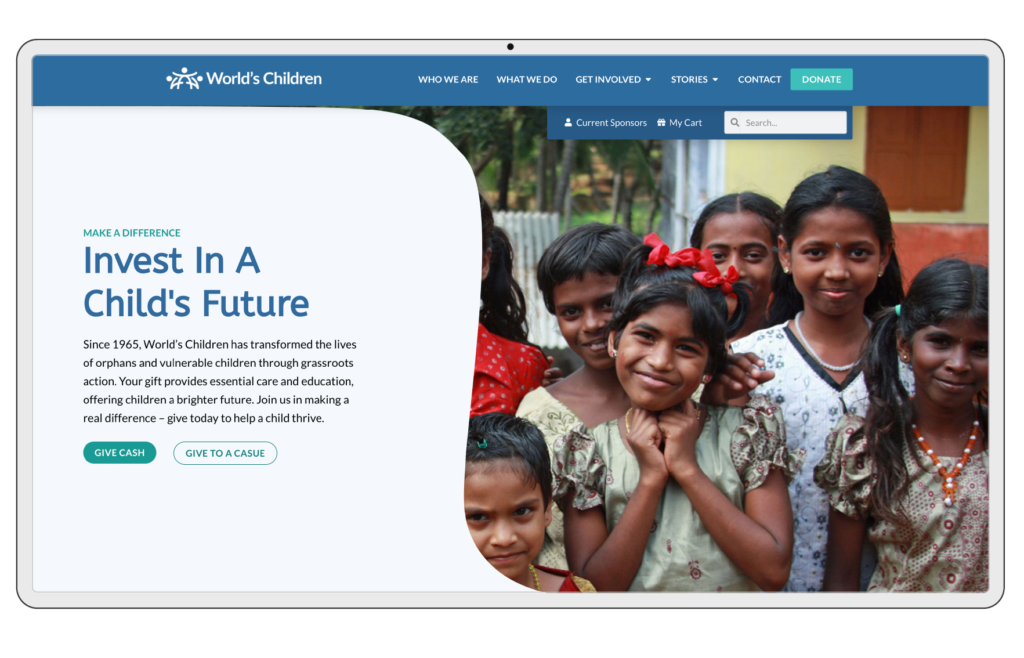
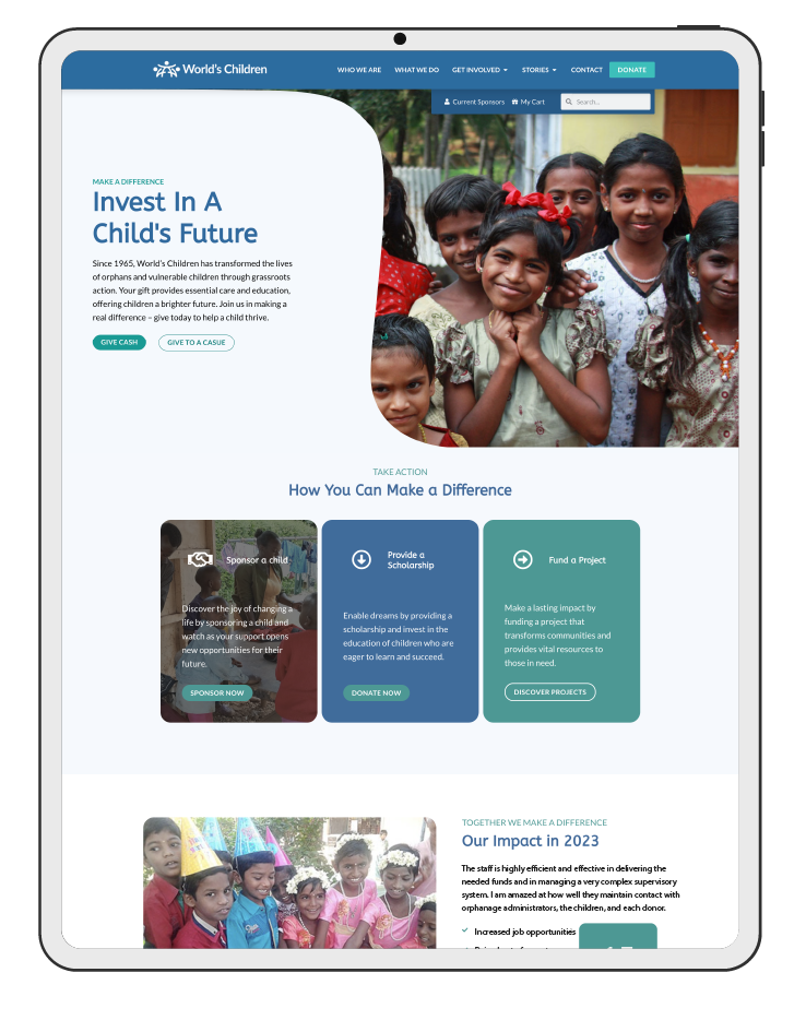
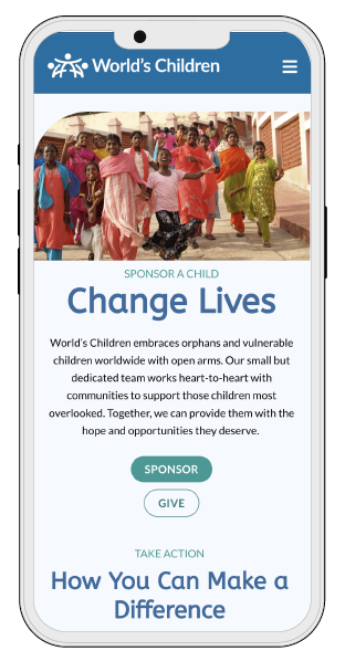
This project follows a clear four-stage approach, designed to deliver a website that not only looks great but actively supports World’s Children’s goals.
World’s Children desired an updated website with intuitive navigation, elevated branding, and responsive design with an easy check-out process.
CLIENT NAME : World’s Children
PROJECT TYPE : UX/UI Design, Branding Development
TIMELINE : 6 months
TOOLS : FIGMA, Illustrator, Photoshop, WordPress, CSS, HTML, PHP
ROLES : UX Researcher, UI Designer, Developer
This project includes four out of the five design thinking framework phases.
The Research phase includes the competitive analysis and user (observational, quantitative, and qualitative) research.
The Define phase includes the user personas, business goals, and a problem-solution matrix.
The Ideation phase includes the sitemap, task flow, low-fidelity wireframes, and responsive wireframes.
And finally, the Prototype phase which includes the mood board, UI kit, high-fidelity wireframes, and high-fidelity prototype.
The team started by getting to know World's Children's audience intimately through observational, quantitative, and qualitative research.
Leveraging insights from Stage 1, I participated in crafting personas, a problem-solution matrix, and an outline of business goals to inform the design of a website that surpasses the current one.
In this stage, we develop the foundation for their website, which includes a sitemap, task flow, and wireframes.
I developed an enhanced brand identity and interface kit, hi-fi wireframes, and, finally, the prototype.
Create an intuitive and responsive navigation system that's easy to use on any device.
Create a smooth and user-friendly experience that encourages them to become heroes for children.
Capture attention with inspiring content and a clean, uncluttered design.
Showcase the stories of the children they help in a captivating way. Let donors see the difference they can make.
To view this case study in its entirety, revisit here on a desktop device.
I’m in the process of adding or updating this project. Come back soon.